How to Use the MACD Indicator
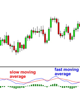
This technical indicator is a tool for identifying moving averages that indicate new trends, whether bullish or bearish.
After all, the first task in trading is to be able to find the trend, because this is where the most money is made.
With MACD charts, you will usually see three numbers used for their setup.
The first one is the number of periods used to calculate the fast moving averages.
The second one is the number of periods used in the slower moving averages.
The third is the difference between the faster and slower moving averages that is used to calculate the number of bars of the moving average.
For example, if you see ” 12, 26, 9″ as the parameter MACD (which is usually the default setting of most charting software), this is how you would interpret it.
The 12 indicates the moving average of the first 12 bars.
The 26 indicates the first 26 bars of the moving average.
The 9 indicates the moving average difference between the above two moving averages.
There is a common misconception when it comes to MACD lines.
There are two lines.
“MACD line”
“Signal line”
The two lines drawn are not moving averages of prices.
The MACD line is the difference (or distance) between two moving averages. These two moving averages are usually exponential moving averages (EMA).
How to trade with MACD
Since there are two moving averages with different “speeds”, the faster one obviously reacts faster to price movements than the slower one.
When a new trend emerges, the faster line (MACD line) will react first and eventually cross the slower line (signal line).
When this “crossover” occurs and the faster line begins to “diverge” or move away from the slower line, it is often a sign that a new trend has formed.
In the chart above, you can see that the fast line crosses the slow line and correctly identifies the new downtrend.
Note that when the lines cross, the histogram disappears temporarily.
This is because the difference between the lines at the time of the crossing is 0.
As the downtrend begins and the fast line deviates from the slow line, the histogram becomes larger, which is a good sign of a strong trend. In the chart above, you can see that the fast line crosses the slow line and correctly identifies the new downtrend.
Remember that the MACD indicator consists of three components.
The MACD line , which represents the difference between two moving averages.
The signal Lin Ë which is the moving average of the MACD line.
The histogram which is a graphical representation of the distance between the MACD and the signal line.
That said, the MACD remains one of the most favored tools for many traders.


Responses