19 Chart Patterns PDF Guide
In this article, we delve into 24 distinct chart patterns, essential tools in technical analysis. Retail traders often utilize these patterns to forecast price movements.
This guide provides a brief description of each chart pattern. You can use the Learn More button to explore these patterns further in conjunction with your trading strategy. For backtesting, find the PDF link to chart patterns at the bottom of this article.
Chart patterns help traders identify potential price movements and make informed trading decisions. These patterns emerge from price movements on a chart, reflecting the collective behavior of market participants. Here’s an overview of some common chart patterns:
Understanding Chart Patterns
Chart patterns refer to natural price patterns that resemble shapes like wedges and triangles. These patterns recur over time and are used by traders to predict future market movements.
Chart patterns appear as price swings or waveforms on candlestick charts, including head and shoulders, double top, and triple top patterns.
Types of Chart Patterns
Chart patterns are primarily distinguished by the trend direction:
Bullish Chart Patterns
- Indicate potential upward movements.
Bearish Chart Patterns
- Indicate potential downward movements.
Based on market structure and shape, these patterns can be further divided into various types.
Top 19 Chart Patterns
While technical analysis can employ many chart patterns, we’ll focus on the 24 most common. These patterns have a high likelihood of predicting market movements successfully.
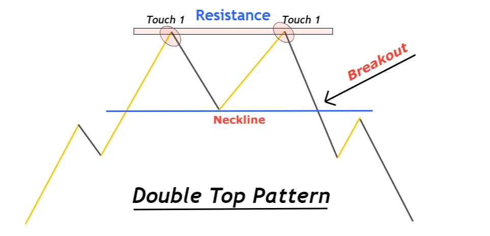
Double Top
- A double top is a bearish reversal pattern formed at resistance levels, showing two price tops. A bearish trend reversal occurs after the neckline breakout.
To draw the neckline, use the lowest swing low of the two tops, forming after a bullish trend completes.
This chart pattern signals a trend shift from bullish to bearish.
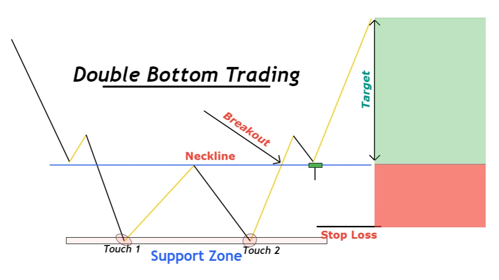
Double Bottom
The Double Bottom is a bullish trend reversal chart pattern. It indicates two consecutive lows within the support zone. A bullish trend reversal occurs after the breakout of the neckline.
The neckline is drawn at the two price bottoms after the price swing that occurred. This pattern must form after a previous bearish trend to be valid. It changes the trend direction from bearish to bullish.
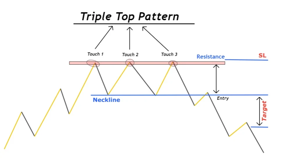
Triple Top
The Triple Top is a bearish reversal chart pattern where the price forms three tops consecutively at the same resistance level. This pattern is widely used by traders in technical analysis.
The neckline connects the pattern’s two swing lows. The Triple Top pattern is confirmed by a trend line breakout, transforming a bullish trend into a bearish price tendency.
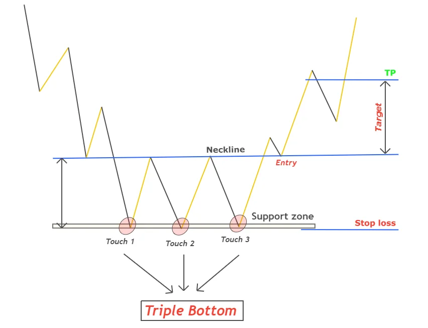
Triple Bottom
A Triple Bottom is a bullish reversal chart pattern where the price forms three bottoms consecutively at the same support level. Understanding price swings and impulsive waves is crucial for trading Triple Bottom patterns effectively.
The neckline appears after linking the three swing highs with a trend line, confirmed to be bullish by its breakout.
Head and Shoulders Pattern
The Head and Shoulders is a reversal chart pattern consisting of three price swings. The head is the highest price swing, with the two waves to the right and left as the shoulders, forming the pattern.
Inverse Head and Shoulders patterns represent a bullish trend reversal. A neckline is formed during this trend, confirmed by its rising movement.
Cup-and-Handle Chart Pattern
The Cup and Handle is a continuation chart pattern where the price forms a round bottom with a handle shape at the end. This pattern can indicate a trend reversal, depending on whether it occurs during a bullish or bearish trend.
An inverse cup-handle chart pattern indicates a bearish tendency. It’s essential to distinguish between V-shaped waves and round bottom waves, as the latter is rare.
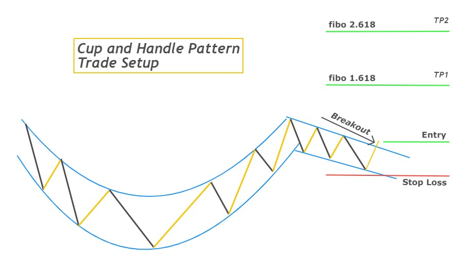
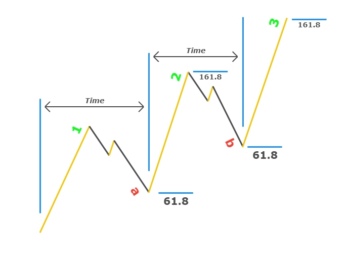
Diagram of Three Drives
This is a reversal chart pattern showing three attempts by significant traders to reach or break a key level, followed by a market trend reversal. It is divided into two categories based on trend direction:
- Bullish Three Drive
- Bearish Three Drive
The Three-Drive Chart Pattern is composed of three impulse waves and two retrace waves, with the number 3 being significant as a Fibonacci number.
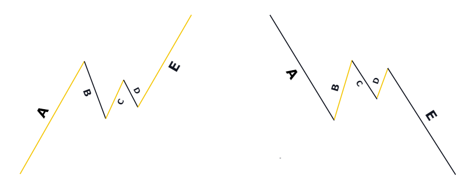
Pennant Chart Pattern
The Pennant Chart Pattern is a continuation pattern using five ABCDE waves, indicating the trend continues after a brief pause. The pattern comprises three retracement waves and two impulse waves, with market consolidation indicating indecision. The trend continues after this indecision when the pattern breaks.
Pennant patterns are divided into two kinds:
- Bullish Pennant Pattern
- Bearish Pennant Pattern
Pattern for a Wedge Chart
Introduction to Wedge Chart Pattern
A trend reversal chart pattern called the wedge features price structures resembling a wedge, where the outer portion is wider than the inner. This pattern illustrates the natural behavior of price movements.
Composition of a Wedge
A wedge is composed of two trend lines (upper and lower) and more than three waves. As the wave size decreases over time, a trend reversal occurs in the market following the breakout of the trend line.
Types of Wedge Patterns
Wedge patterns are classified into two types based on their price structure:
- Falling Wedge Pattern: Indicates a bullish trend reversal.
- Rising Wedge Pattern: Indicates a bearish trend reversal.
Detailed Analysis of Wedge Patterns
A rising wedge suggests that the market, currently experiencing a bearish trend, is about to turn.
Diagram of a Diamond Chart
Introduction to Diamond Chart Pattern
The diamond pattern is a unique chart pattern that can indicate both continuation and reversal of trends, where the price forms a diamond structure on the chart. This pattern is created from two different market movements: inward consolidation (broadening) and forward consolidation (inward consolidating).
Types of Diamond Patterns
The pattern’s classification as a trend reversal or continuation depends on its location:
- Bullish Diamond Pattern: Forms near the bottom of a bearish trend, indicating a potential bullish reversal.
- Bearish Diamond Pattern: Forms at the peak of a trend, indicating a potential bearish reversal.
Continuation Pattern
If a diamond pattern forms mid-trend, it serves as a continuation pattern, maintaining the current trend direction.
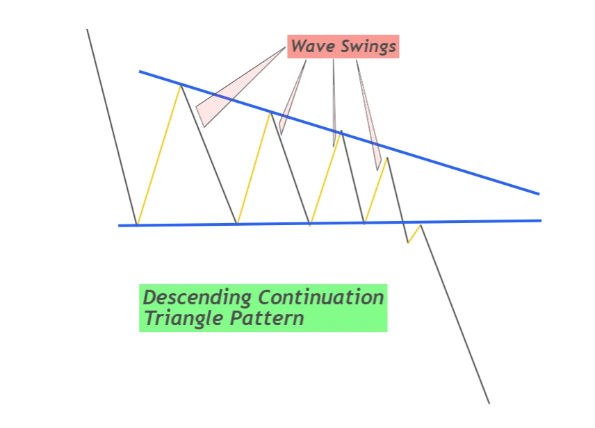
Triangle Pattern with Descendent Triangles
Introduction to Descending Triangle Pattern
A descending triangle is a bearish continuation chart pattern where the price forms a triangle with a horizontal line at the base and a descending trend line.
Characteristics of the Descending Triangle Pattern
This pattern features price swings where each wave is progressively smaller than the previous one. The bottom of these waves forms a support zone. When this support zone is broken, the bearish trend continues.
Reversal and Continuation
While primarily a continuation pattern, the descending triangle can occasionally indicate a reversal.
Final Remarks
Understanding and identifying these chart patterns—wedge, diamond, and descending triangle—can provide valuable insights into market trends and potential reversals. Using these patterns in technical analysis can enhance trading strategies and decision-making processes.
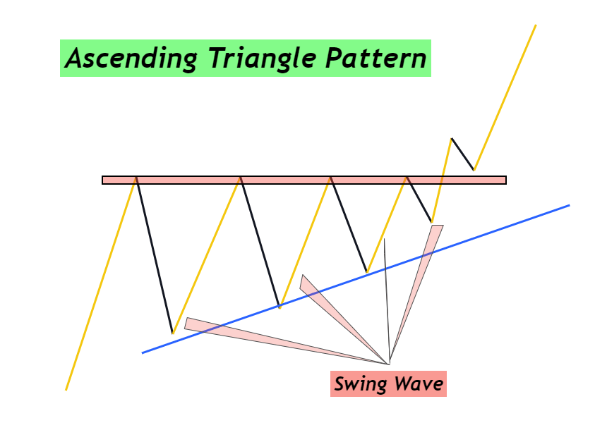
Ascending Triangle Pattern
The ascending triangle is a bullish continuation chart pattern where the price forms an ascending triangle with a horizontal base at the top.
In an ascending triangle pattern, the support zone is at the bottom, while the resistance zone is at the top. This pattern is the reverse of the descending triangle. After the resistance breakout, the bullish trend will continue, forming swing waves. This pattern is easy to spot, providing a high chance of successful trades.
Tip: GBPJPY pairs often form ascending triangles on their price charts over different time periods.
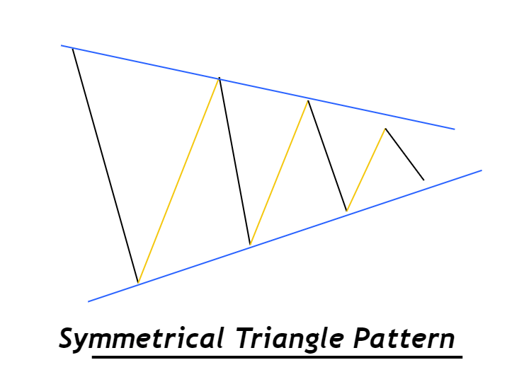
Symmetrical Triangle Pattern Chart
The symmetrical triangle pattern can indicate either a continuation or reversal trend due to the equal chance of a bullish or bearish trend. This pattern shows that market makers are making decisions, leading to price movement either inward or sideways. Each wave that consolidates inward is smaller than the previous one.
To identify the trend direction with a symmetrical triangle, use the breakout method. Draw trendlines that correspond with lower highs and higher lows, indicating whether sellers or buyers are controlling the market. If the upper trendline breaks, buyers will seize the market; if the lower trendline breaks, sellers will dominate.
Flag Chart Pattern
Flag patterns are continuation trends consisting of both impulsive and retracement waves. This pattern is widely used and advanced, offering deep insights into forex market direction.
Flag patterns are classified based on wave structure into two types:
- Bullish Flag Pattern: Consists of an impulsive bullish wave combined with a bearish retracement wave. The impulsive wave resembles a pole, indicating that the bullish trend will continue.
- Bearish Flag Pattern: Combines a bearish impulsive wave with a bullish retracement wave.
Flag patterns are commonly seen in assets, currencies, and commodities.
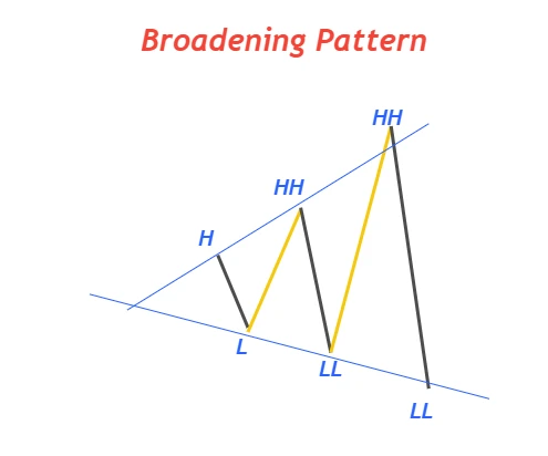
Broadening Pattern / Megaphone Pattern
A broadening chart pattern refers to a structure where each wave is greater than the previous one, creating a megaphone-like shape on the price chart. This pattern symbolizes market indecision and a potential major trend reversal.
Megaphone chart patterns can be classified based on their structure and location:
- Ascending Broadening Pattern: Results in lower lows and higher highs.
- Descending Broadening Pattern: Results in higher highs and lower lows.
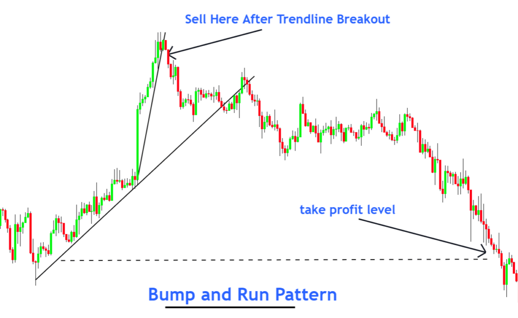
Bump-and-Run Chart
The Bump-and-Run chart pattern consists of two phases: the Bump phase and the Run phase. During the Bump phase, the price moves up or down with significant force, breaking through major key levels. Once the Bump phase ends, the Run phase begins.
This strategy is often used by market makers to deceive retail traders.
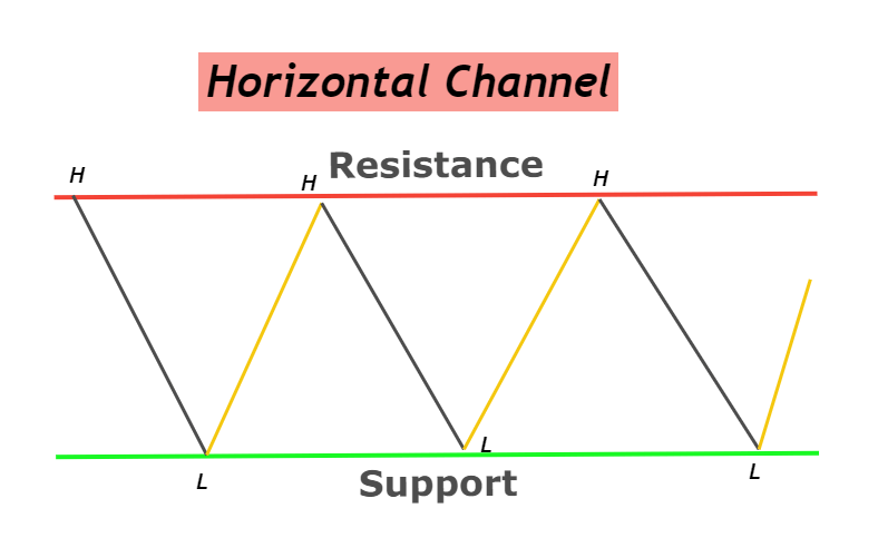
Horizontal Trend Channels
Horizontal trend channels indicate sideways price movements between a resistance area and a support region. This pattern shows that buyers and sellers have equal power, resulting in a skewed price trend. A breakout from these trend channels signals the direction the price trend will take. If the support zone fails, it indicates a bearish trend, whereas if the resistance zone falls, it forms a bullish pattern.
Horizontal trend channels consist of price movements that form swings, making highs and lows. This market condition is also known as a ranging market.
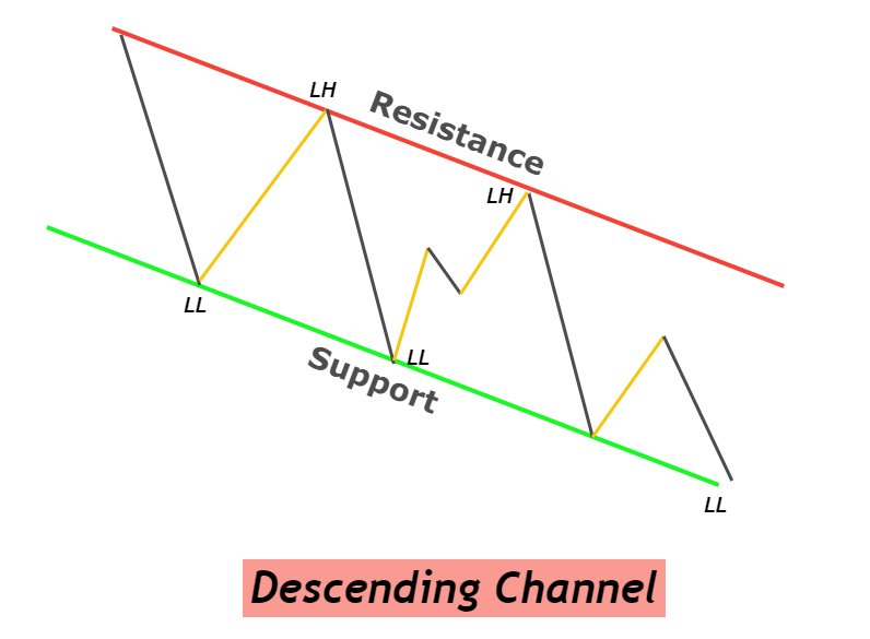
Descending Channel Pattern
The Descending Channel pattern is a bullish trend reversal pattern that occurs when the price moves within a descending channel. The bullish trend begins after a breakout of the upper trendline.
This pattern is characterized by lower lows and higher highs. The lower price swings have lower highs along the upper trendline, while the lower price wave forms lower lows.
It is essential not to confuse the descending wedge with the descending channel due to their parallel trendlines.
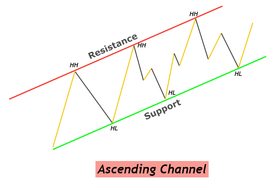
Ascending Channel Pattern
The Ascending Channel pattern is a bearish trend reversal pattern that occurs when the price moves within an ascending channel. It is characterized by higher price highs and lower lows.
The upper trendline acts as resistance, while the lower trendline provides support. A bearish trend is confirmed when a bearish candlestick breaks the lower trendline. This pattern indicates a transition from a bullish price trend to a bearish one.
Conclusion
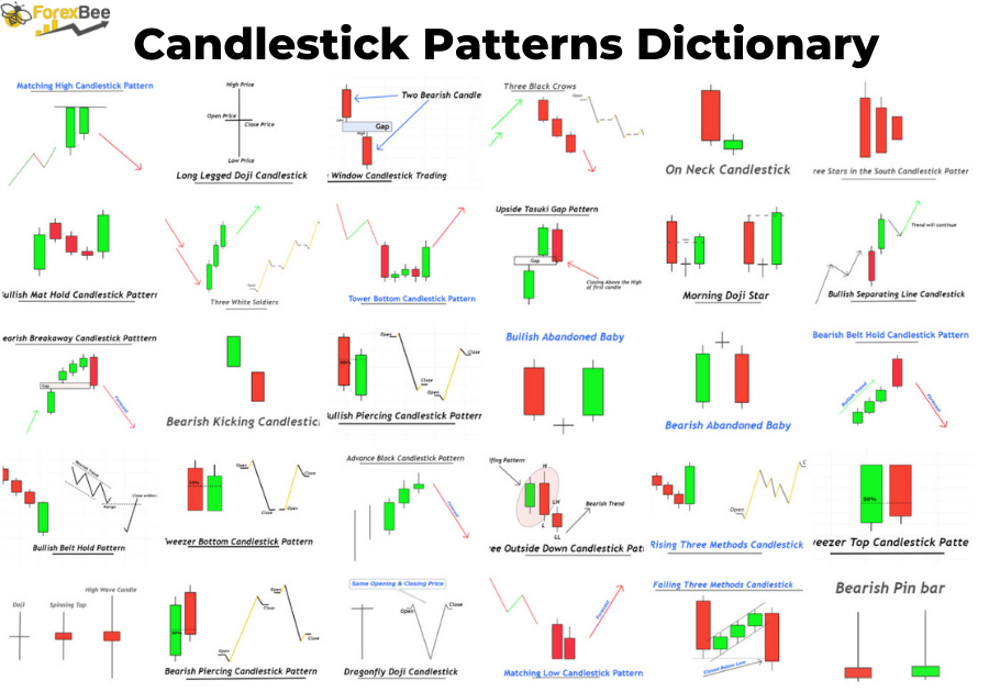
Chart patterns are extensively used by retail traders to forecast market conditions. These patterns are repetitive and can be identified over time on the charts of various currencies. When trading, it is advisable to use chart patterns in conjunction with other technical tools, such as candlestick patterns, to enhance trading success.


Responses